Color decisions for curtain varieties rarely happen under the soft lighting of a showroom. They happen at home, in the exact spot where a set of drapes will hang for years, often around ten in the morning when Doha's sun is already pouring through the glass. Learning how to choose curtain color starts with watching that light for a few days, not picking from a swatch card under a shop’s bulb.
Most people get stuck between two instincts. One says match the walls so nothing clashes. The other says pick a favorite color and hope it works. Neither instinct accounts for what the room actually does during the day, and that gap is where most curtain regrets come from.
A living room in Doha usually faces two extremes in one day: bright, direct sun in the afternoon and near total darkness once the blackout drapes close for a film night. Curtain colors for living room spaces need to handle both without looking flat in either state.
Warm neutrals such as sand, taupe, and soft terracotta tend to hold up well here. They don't fight with tile flooring or the gold-toned fixtures common in Qatari villas, and they don't show sun fading as fast as saturated colors like deep red or navy. If you want a bolder look, save it for an accent panel rather than the full window, since a small dose of color reads as intentional while a full wall of it can overwhelm a bright room fast.
Color research backs up what most decorators already sense by instinct. A long-running study out of the University of Bologna tracked hundreds of students living in identical buildings that differed only by interior color,, and it found a clear preference for blue interiors, with cooler tones linked to a calmer mood overall. The study followed 443 students living in six color-coded buildings and found a clear preference for blue interiors, followed by green, violet, orange, yellow, and red.
The practical takeaway for a home isn't that everyone needs blue curtains. It's that warm colors like red, orange, and mustard tend to energize a space, while cooler blues, greens, and soft greys tend to settle it. Match that effect to what the room is actually used for, not just what looks good in a photo.
A second rule worth remembering: light colors make a small room feel wider, since they bounce daylight back into the space rather than absorbing it. Dark curtains do the opposite, pulling the walls in visually, which works well in a large majlis but can make a compact bedroom feel boxed in.
Curtain colors for bedroom windows carry more weight than any other room, mostly because of what happens after the lights go off. Deep blues, muted greens, and warm greys are common choices because they read as restful rather than stimulating, and they hide the wear that comes from being drawn shut every single night.
Fabric weight matters just as much as shade here. A pale color in a sheer weave still lets in early light, which some people want and others find disruptive. If total darkness matters more than the shade itself, a blackout lining changes the equation regardless of color, and it's worth asking about when the fabric is chosen rather than after installation.
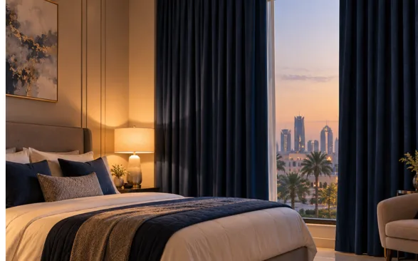
Curtains to match wall color exactly can look flat once the sun hits them, since two nearly identical shades under direct light tend to blur into each other rather than creating any depth. A better approach, and one most stylists lean on, is choosing a curtain color one or two shades darker or lighter than the wall or picking a complementary tone from the same color family.
If the walls are already a strong color, such as a deep teal accent wall, curtains in a neutral or slightly muted version of that same hue usually read as coordinated without competing for attention.
Color choice in Doha can't be separated from the climate. Direct sun bleaches darker, saturated colors faster than muted tones, and a curtain that faces west will fade differently than one facing north within the same year. Fabrics built for regional heat, such as those used in sunscreen roller blinds, cut glare without locking the room into a single color choice, since they work as a functional layer behind the decorative curtain rather than replacing it.
For rooms that need full darkness regardless of curtain color, a dedicated blackout curtain handles the light control, freeing up the visible fabric to be chosen purely on shade and texture. And for anyone weighing curtain color ideas against hardware, a hidden curtain track and rail system lets the fabric itself stay the visual focus, without a visible rod competing for attention.
There's no single right curtain color for every Doha home; the answer is how to choose curtain color based only on how a specific room is lit, used, and lived in. Watch the light in the room for a few days before deciding, hold a fabric sample against the wall at different times, and let the room's actual function guide the shade more than a trend ever should.
Usually, yes. Dark, saturated colors absorb light instead of reflecting it, which pulls the walls in visually. If the room is already tight on space, a lighter neutral or a soft cool tone will read as more open, especially when paired with sheer layering underneath.
Mid-tone colors, think warm greys, muted taupes, or soft olive, hide everyday dust better than pure white or very dark shades. White shows dust fast, and black can actually show lint and sun fading more clearly than people expect.
Neither has to be the rule. Matching the wall too closely can look flat, while matching the sofa exactly can feel a bit matched-set. A shade that pulls from either one, without copying it directly, usually gives a room more depth.
Over time, most fabrics shift slightly under constant UV exposure, and white is no exception. A tightly woven cotton blend or a UV-resistant synthetic holds its color longer than a loose linen weave in a west-facing window.
Absolutely, and it's actually common in larger homes. The main thing to watch is flow between adjoining spaces, like an open-plan living and dining area, where a shared color family keeps the transition from feeling disjointed.
© 2026 - Aspire Furniture All rights reserved. Powered By SilverHost